Importance of Grid in Graphic Design
Last Updated on July 1, 2024 by Ilka Perea Hernández
While some designers avoid the use of the grid to achieve free and intuitive design, the most successful have done so by relying on it. The importance of grid in graphic design lies not only in the arrangement of the elements in design but also in the elegance and aesthetics of the entire design.

The main goal of a grid is to establish a set of guidelines for how elements should be placed within a design. In other words, grids make content accessible and help the viewer understand where to find the following information throughout the design. As a result, the viewer will naturally identify these breakdowns and be drawn to them, allowing the designer to play with the hierarchy of a layout and modify the meaning of a project.
In addition, there is a theory about design called the Usability Effect. Essentially, this theory states that when something is designed to be beautiful, it will also be easily usable. This is an especially important concept in all design: from architecture to graphics, a well-designed grid makes your design not only more beautiful but also more useful!
Grid

What is a Grid?
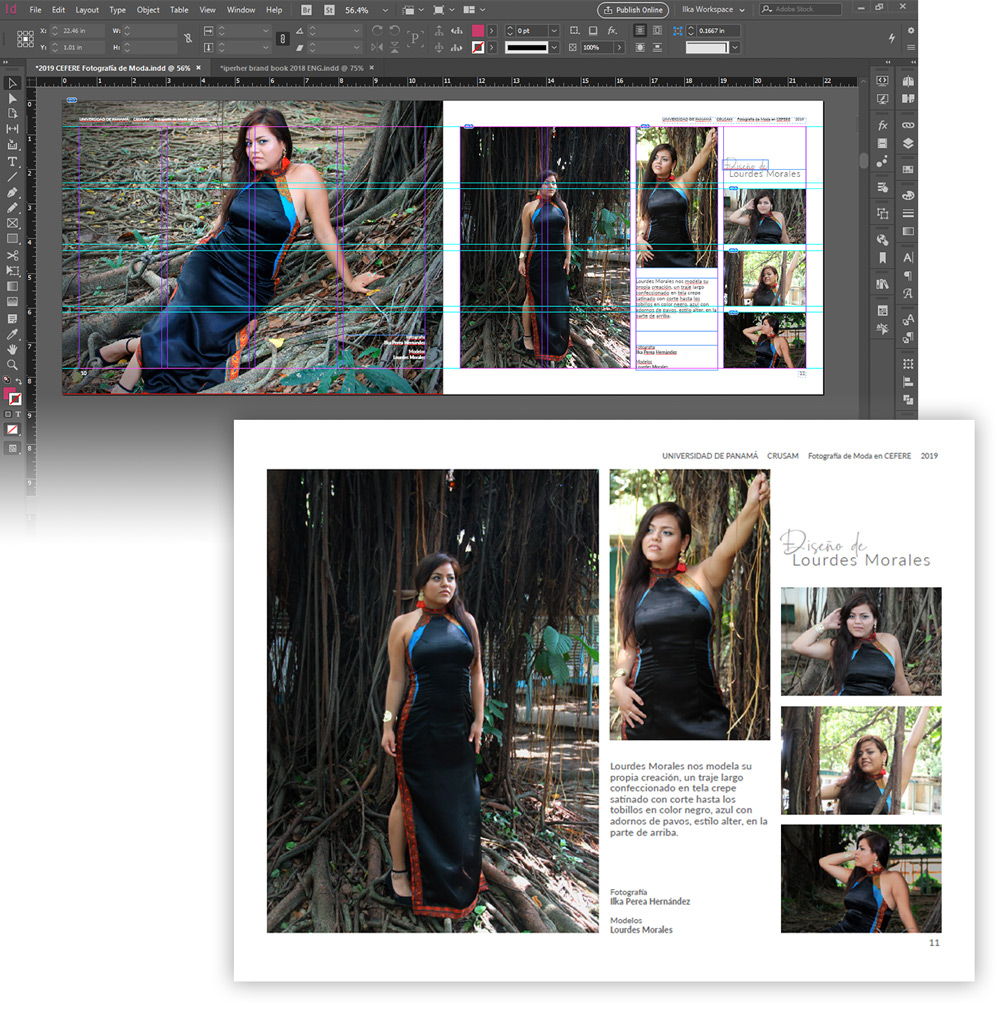
In graphic design, the grid is a structure based on lines, generally vertical and horizontal, which helps to order coherently all the elements of the composition, so they are:
- title
- subtitle
- body text
- images
- footer and image credit
- outstanding ideas
- pagination
Among the parts of the grid, modules are cells generated by imaginary lines. So, modules are where the elements are placed with different distributions. Moreover, the grid is not only about squares but also about proportions. This is the most important concept in the theory of the grid.
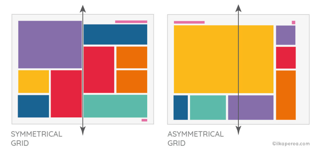
Besides, all grids can be designed in two ways:
- Symmetrical
- Asymmetrical

Symmetrical grids follow a central line. The vertical margins are equal, as well as the horizontal ones. Likewise, columns also have the same width in a symmetrical grid.
However, in an asymmetrical grid, both margins and columns can be different from each other. It is important to always seek balance when using an asymmetrical design.
“Just as in natural systems of order govern the growth and structure of animate and inanimate matter, so human activity itself has, since the earliest times, been distinguished by the quest for order.” — Josef Müller-Brockmann
The grid has long been an invaluable tool for creating order where there is chaos. In recent years, the grid system has become fundamental to web design with the development of “CSS Responsive” for adaptability to desktop and mobile devices. Web design is not conceived without the use of a grid.
Importance of Grid

What is a Grid for?
As Josef Müller-Brockmann explains in his book Grid Systems: “Typographers, graphic designers, photographers, and exhibition designers use the grid to solve visual problems in two and three dimensions”.
He continues: “Organizing surfaces and spaces according to a grid allows the designer to arrange texts, photographs, diagrams, etc., according to objective and functional criteria. The visual elements are reduced to a few formats of equal dimensions. The size of the illustrations is established according to their thematic importance”.

Benefits
The importance of grid in graphic design and its application could be summarized in the following criteria:
Hierarchy
It helps to organize and prioritize the elements within the design. Indeed, the grid helps to keep the content organized, aligned, clean, and structured. In other words, it gives a hierarchy to the elements. It makes it easier to judge which is more outstanding. Guide at sight for better visual navigation.
Balance
It gives balance and constancy to the composition. It offers balance to the design in a symmetrical or asymmetrical way but is always consistent.

Aesthetics
It adds beauty to the design. This clarity translates into a pleasing experience for the eye. It gives the design aesthetics and visual elegance. The audience or viewers of the design appreciate these characteristics. Josef Müller-Brockmann points out that “The reduction of the number of visual elements used and their subordination to the grid system produces an impression of conciseness, intelligibility, clarity, and order in the design. This order strengthens the credibility of the information and generates confidence in the receiver”.
Efficiency
It makes the graphic designer’s job easier. The use of the grid speeds up the design process. Indeed, it makes the work faster, easier, and better. It helps to save time by being a guide to placing each type of content in its respective place.
Designers make thousands of decisions about concepts, materials, style, shapes, typography, dimensions, color, placement, proportion, and size. When the grid is determined in advance, the designer can spend time with the other parts of the project. A well-defined grid can free up the thinking process by taking some decisions off the table.
It is a natural and time-saving solution for most design projects. Regardless of the medium for which the grid is being used, it can be reused over several pages, reducing the time needed to build a new one.

Perception
Preview the spaces for each element. It is easy to distinguish the places and spaces that each element of the composition will occupy, including negative spaces. Often the mistake is made of filling in all the spaces in the design giving a feeling of suffocation and oversaturation where nothing stands out. However, the grid helps to visualize which areas can serve as blank spaces or negative spaces to give air to the design and direction to the view toward the elements you want to highlight.
Some Insights
There are several considerations that must be considered before applying grids to a project. Once the importance of grids in graphic design has been understood, as a next step, I recommend identifying the components of the grid.
“The grid system is an aid, not a guarantee.” — Josef Müller-Brockmann
Before concluding, I would like to point out that the use of the grid is a guide. The importance of grids in graphic design is focused on the benefits of working with a well-structured guide, which simplifies the work.
However, sometimes the designer must follow his instincts and go outside the framework of the grid. Timothy Samara, in his book “Designing with and without the Grid”, deals with this issue. But to break the rules, you must first learn them.
Cite this post
- APA Style:
Perea Hernandez, I. (2019, February 4). The importance of grid in graphic design. Ilka Perea Studio. Retrieved from https://ilkaperea.com/2019/02/04/importance-of-grid-in-graphic-design/ - Chicago Style:
Perea Hernandez, Ilka. “The Importance of Grid in Graphic Design.” Ilka Perea, February 4, 2019. https://ilkaperea.com/2019/02/04/importance-of-grid-in-graphic-design/. - MLA Style:
Perea Hernandez, Ilka. “The Importance of Grid in Graphic Design.” Ilka Perea, 4 Feb. 2019, https://ilkaperea.com/2019/02/04/importance-of-grid-in-graphic-design/. Accessed [current date]. - Harvard Style:
Perea Hernandez, I. 2019. The importance of grid in graphic design. Ilka Perea Studio, 4 February. Available at: https://ilkaperea.com/2019/02/04/importance-of-grid-in-graphic-design/ [Accessed ‘current date’].

Share
Spread the love… and this post!
If you liked it, share this post on your social networks. Smart designers share good things with others.

Bibliography
- Dabner, D., Stewart, S., Vickress, A. (2020). Graphic Design School: The Principles and Practice of Graphic Design (7th ed.). Wiley.
- Leborg, C. (2006). Visual Grammar: A Design Handbook (Visual Design Book for Designers, Book on Visual Communication). Princeton Architectural Press.
- Malamed, C. (2009). Visual Language for Designers: Principles for Creating Graphics That People Understand. Rockport Publishers.
- Müller-Brockmann, J. (1996). Grid Systems in Graphic Design: A Visual Communication Manual for Graphic Designers, Typographers and Three Dimensional Designers. Niggli AG Verlag.
- Poulin, R. (2018). The Language of Graphic Design Revised and Updated: An illustrated handbook for understanding fundamental design principles. Rockport Publishers.

