Visual Communication Concepts for Graphic Design
Last Updated on June 30, 2024 by Ilka Perea Hernández
Communication that is done through sight is called visual communication. It plays a key role in our daily lives. For example, facial expressions, gestures, signs, maps, graphs, and posters all contain visual communication. It offers a more efficient and aesthetic transmission of ideas, so it is important to know the concepts of visual communication for graphic design.
Table of Contents
- Visual Communication
- Why are Visual Communication concepts important for Graphic Design?
- Advantages of Visual Communication
- Ease of understanding
- Increased efficiency
- Improving the aesthetics of a presentation
- Flexibility for intercultural communication
- Effective for illiterate readers
- Oral communication aid
- More comfortable
- Disadvantages of Visual Communication
- Incomplete method
- Time as a resource
- Ambiguity
- Visual Language
- What is the difference between Visual Communication and Visual Language?
- Visual Codes
- What are visual codes?
- What is a sign?
- Some Insights
- Any Thoughts?
- Cite this post
Visual Communication

Why are Visual Communication concepts important for Graphic Design?
Visual communication is the transmission of ideas and information in ways that can be perceived wholly or partly by sight. Among its benefits are instantaneous transmission, ease of understanding, and cross-cultural communication.
Visual communication involves the transmission of messages through visual media and is therefore considered one of the most important basic concepts in graphic design. It also explores the idea that a visual message that accompanies text has a greater power to inform, educate, or persuade a target audience or public, for instance, in books, magazines, interactive design, videos, advertising design, corporate identity, or packaging design.
Advantages of Visual Communication
Ease of understanding
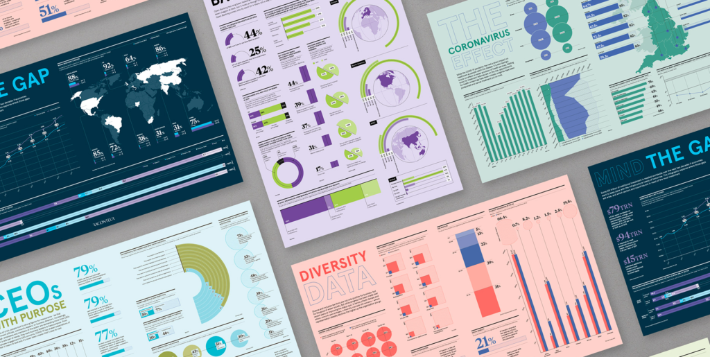
One of the main advantages of visual communication is its simplicity. Complex information, data, and numbers can be easily presented in graphs, images, and diagrams.

Increased efficiency
Visual techniques help prevent loss of time. Oral and written communication takes a long time to exchange information; instead, messages arrive more quickly when they are communicated visually. Visual communication helps make quick decisions. Imagine a sign in red. Without reading, it is known to be a matter of caution, and the senses are alerted.

Improving the aesthetics of a presentation
Not only are they easier to read, but they also make the information more attractive to see. Charts, graphs, tables, etc. are color-coded, making them easier to see. Imagine numbers thrown on a sheet versus numbers visually arranged on the sheet using shapes that are easier to understand.

Flexibility for intercultural communication
When people cannot understand a foreign language, a symbol or image will remove the language barriers. Therefore, many public places use signs as well as words to send messages. Such flexible communication can reduce geographical distance and cross-cultural differences.

Effective for illiterate readers
Remarkably, like the case of cultural difference. Regardless of the language, if the receiver is illiterate, visual communication can replace written communication by making the exchange of information more effective. They can easily understand the information that is presented visually. For example, storybooks for preschoolers.

Oral communication aid
Visual techniques can be used with oral communication. This type of communication becomes more meaningful if graphics, images, and diagrams are used with it. For example, teaching materials for education or museum exhibitions and murals.

More comfortable
Visual communication is more comfortable because people don’t like long speeches and explanations. Consequently, most people prefer an attractive image that summarizes the message. For example, infographics.
Disadvantages of Visual Communication
There are some limitations to visual communication:
Incomplete method
This technique is considered an incomplete method because a visual presentation is not sufficient to communicate everything. However, it can be a successful method if complemented by oral communication.
Time as a resource
Sometimes visual techniques require a lot of time to be designed. While oral communication can be immediate.

Ambiguity
Sometimes the visual message is misinterpreted by the receiver, so the message is distorted. Both the sender and the receiver are required to share a common frame of reference and the same context.
Visual Language

What is the difference between Visual Communication and Visual Language?
Visual language is the communication system used in the creation of visual messages. While visual communication allows the exchange of information through sight, visual language is the set of graphic images and signs used to encode the elements that have been seen. In other words, visual language supports visual communication.
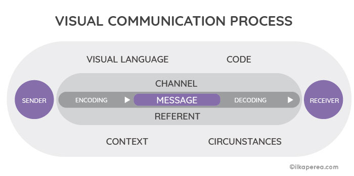
But visual language is subject to certain semiotic rules because it is a system of signs that must be coded (by the designer) and decoded (by the audience or users) who share the same visual language. Therefore, visual communication takes place.
In order to strategically build your message, the designers must know the different visual signs to use them properly in their design and recognize the power of an image to convey a clear, direct, and eye-catching message.
Visual Codes

What are visual codes?
Visual language is composed of codes that encrypt the message to be transmitted and interpreted by the receiver, audience, or target public. Learning these codes implies adopting the values embedded in them.
Semioticians seek to identify codes, the tacit rules, and constraints that underlie the production and interpretation of meaning within each code. Understanding the meaning of these visual codes requires learning about visual signs.
What is a sign?
Signs can be defined as something that refers to something else that is absent. Signs are containers of concepts that gain meaning when they are interpreted by memory, similarity, or analogy. Semiotics deals with signs and their relationship to objects and meaning.
Visual signs can take different forms. For instance, they can be a logo, a geometric figure, a photograph, or graffiti that are considered visual signs. Charles Sanders Peirce classified signs into three types: index, icon, and symbol.
Some Insights
Visual communication has a fundamental role in the development of the discipline of graphic design. Its practice requires understanding its benefits and limitations, as well as the elements that compound them. The exercise of observing, visualizing, composing, and coding to create a powerful, aesthetic, and understandable visual message requires designers to develop their visual literacy.
Any Thoughts?
In the comments section, tell me if you already knew about these characteristics of visual communication. As a designer, which of the disadvantages of visual communication is most difficult for you? What do you recommend other designers do to improve their visual communication skills?
Cite this post
- APA Style:
Perea Hernandez, I. (2018, February 3). Visual communication concepts for graphic design. Retrieved [insert current date] from https://ilkaperea.com/2018/02/03/visual-communication-concepts-for-graphic-design/ - Chicago Style:
Perea Hernandez, Ilka. “Visual Communication Concepts for Graphic Design.” Last modified February 3, 2018. Accessed [insert current date]. https://ilkaperea.com/2018/02/03/visual-communication-concepts-for-graphic-design/. - MLA Style:
Perea Hernandez, Ilka. “Visual Communication Concepts for Graphic Design.” Ilka Perea, 3 Feb. 2018, https://ilkaperea.com/2018/02/03/visual-communication-concepts-for-graphic-design/. Accessed [insert current date]. - Harvard Style:
Perea Hernandez, I. (2018) What is design? Definition, art, and branches. [online] Avail2018. Visual communication concepts for graphic design. [online] Available at: https://ilkaperea.com/2018/02/03/visual-communication-concepts-for-graphic-design/ [Accessed ‘insert current date’].

Share
Spread the love… and this post!
If you liked it, share this post on your social networks. Smart designers share good things with others.
Bibliography
- Chandler, D. (2017). Semiotics: The Basics. Routledge.
- Hébert, L. (2019). An Introduction to Applied Semiotics. Routledge.
- Hébert, L. (2006). Sign Structures. The Sign according to Klinkenberg. Signo. http://www.signosemio.com/klinkenberg/sign-structures.asp.
- Leborg, C. (2006). Visual Grammar: A Design Handbook (Visual Design Book for Designers, Book on Visual Communication). Princeton Architectural Press.
- Lupton, E.; Phillips, J. C. (2015). Graphic Design: The New Basics (2nd ed.). Princeton Architectural Press.
