
Importance of Pantone Colors of the Year in Graphic Design
Last Updated on December 28, 2023 by Ilka Perea Hernández
Among the tools available to graphic designers is the Pantone Matching System color guide. The importance of Pantone Color of the Year in Graphic Design lies not only in the use of this effective color guide but also in the information it provides about market trends.
Within the design process, choosing the right color is one of the riskiest decisions designers make. Colors communicate, persuade, motivate, and influence the decision-making of the end-user of the designs. The choice of color should not be based only on its symbolic and psychological attributes. Designers must consider public taste and market trends. This is where Pantone Color of the Year plays a role.
[cite]
Pantone Color of the Year
What Is the Pantone Color of the Year?
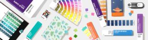
Designers use the Pantone Matching System (PMS), which is the standard language for color communication, to choose accurate colors that can be reproduced exactly by printers and manufacturers. This is one of the reasons why it is so popular in the design industry.
Pantone Color of the Year is an effort that has been led by the Pantone Color Institute™ for more than 20 years. This initiative proposes a color from Pantone’s color palette based on an exhaustive analysis of market trends. This analysis takes into consideration all design sectors, such as architecture, fashion, and graphic design. The group of experts behind this analysis also studies the entertainment industry, socioeconomic behavior, the use of materials, as well as new technologies.
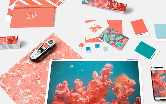
The result of this research is a chromatic proposal that will influence decision-making throughout the design industry, from branding, product development, packaging design, and web UI. Not surprisingly, the creative community is on the lookout every December for the announcement of the Pantone Color of the Year.
Pantone Color of the Year for Graphic Design
Why is the Pantone Color of the Year so Important?
Although the first Color of the Year was chosen in 2000, it was not until 2007 that the proposals gained relevance among the design community. Hundreds of brands create merchandise with the Color of the Year; fashion designers include it in their creations, interior designers add it to their spaces; and graphic designers create templates for social media.
It is important to emphasize that Pantone’s Color of the Year is a proposal for the consumer. In other words, this color is intended for use in consumer products, not for brand logo design. Graphic designers and marketing directors should be clear about this distinction. The choice of colors for a logo involves other considerations, and it is not recommended to follow annual color trends. It is possible to create advertisements with new colors without changing the brand colors.
Some Creative Ideas
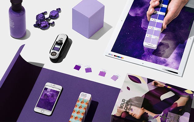
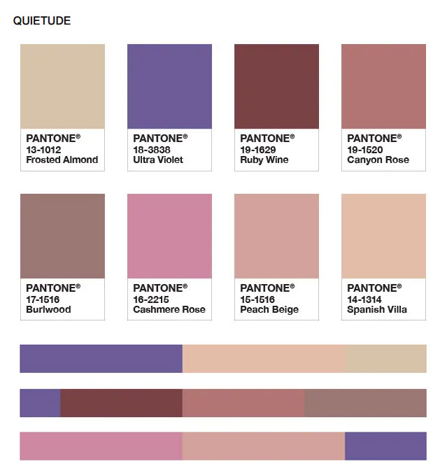
- Create a color palette with Pantone’s Color of the Year. With each announcement, Pantone creates a dedicated Color of the Year page with some proposed color palettes. As a designer, you should create your own and adjust them to the requirements of your design. Besides, it’s always fun to do this chromatic exercise.
- Incorporate Pantone Color of the Year into your photography. Integrate some Color of the Year elements into the composition of your product, portrait, landscape, or food styling photos. The color palettes you created previously will help you maintain color harmony throughout your shoot.

- Create templates with the Pantone Color of the Year. Sell ready-to-use designs as templates or graphics for social media, illustrations, decorative prints, or merchandising products.
Some Insights
To summarize, the importance of Pantone Color of the Year in Graphic Design could be clustered into two major subjects:
On the one hand, the market trend. Imagine if every company had to do market research to choose the colors it would implement in its marketing strategy for the following year. The Pantone Color Institute provides this information free of charge, saving companies time and money.
On the other hand, Pantone is a recognized brand. Among color profiles, graphic designers rely on the color consistency provided by the Pantone Matching System. The Pantone Color of the Year will be a shade that designers can be sure to use from the beginning of the process to the end of the production, printing, or manufacturing of their designs.
Share
Spread the love… and this post!
If you liked it, share this post on your social networks, such as Facebook, LinkedIn, or Twitter. Smart designers share good things with others.

Bibliography
- Dabner, D., Stewart, S., Vickress, A. (2020). Graphic Design School: The Principles and Practice of Graphic Design. (7th ed.) Wiley.
- Pantone. (n.d.). Pantone Formula Guide | Coated & Uncoated Gp1601a. Retrieved May 7, 2020, from https://www.pantone.com/formula-guide-coated-uncoated
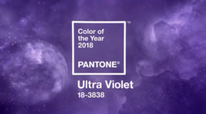
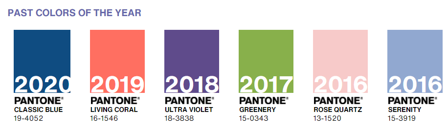
- Pantone. (n.d.). Pantone Color of The Year 2018 – Pantone 18-3838 Ultra Violet. Retrieved June 15, 2020, from https://www.pantone.com/articles/past-colors-of-the-year/color-of-the-year-2018
- Pantone. (n.d.). Past Colors Of The Year. Retrieved June 15, 2020, from https://www.pantone.com/articles/past-colors-of-the-year