What are Signs? — How to Use Visual Signs in Graphic Design
Last Updated on March 13, 2024 by Ilka Perea Hernández
Signs are vehicles that carry meaning for what they represent. Understanding how to use visual signs in graphic design makes it possible to create graphic messages with a direct meaning and, consequently, reduce visual communication ambiguities.
When designers want to create projects with meaningful and striking messages that capture the imaginations of their viewers, they turn to the resources offered by visual communication concepts. For instance, visual signs can convey a great load of meaning that can be understood and interpreted by diverse cultures or societies, if the same visual language codes are used.
By learning the difference between signifier and signified and how to apply the diverse types of visual signs, designers will be able to create high-impact connotative messages.
Table of Contents
- Sign
- What is a sign?
- One sign — Several signified
- Positive Connotation
- Negative Connotation
- In practice…
- Sign Structure
- Sign Components
- Visual Signs
- What are the visual signs?
- Index
- Index Summary
- Icon
- Icon Summary
- Symbol
- Symbol Summary
- Difference between icons and symbols
- The “icons” that aren’t icons…
- Summary
- Some Insights
- Any Thoughts?
Sign

What is a sign?
Signs can be defined as those that refer to or represent something else, that is absent. In other words, signs are containers of concepts that gain meaning when they are interpreted by memory, similarity, or analogy. However, signs do not have any meaning by themselves, we give them meaning when we interpret them.
Semiotics deals with signs and their relationship to objects and meaning. Ferdinand de Saussure, one of the founders of semiotics, saw signs as the basic unit of meaning and defined their two parts: the signifier and the signified.
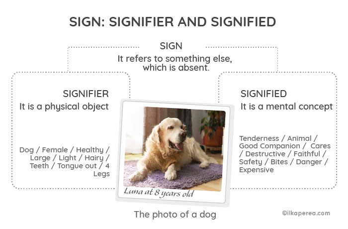
In short, the signifier is the existing physical reference or representation associated with something (e.g., the dog), the signified is the idea or concept of the thing (e.g., the idea that evokes the image of the dog), and the sign is the object that combines the signifier and the signified into a meaningful unit (the photo of the dog). Sign is the relationship between the concept and the representation of that concept.
One sign — Several signified

For this example, you can see a photograph of a big brown labrador retriever. The photograph is the sign.
Firstly, let’s imagine two scenarios: one represented by Amanda, the other by David. In both scenarios, the dog is not present, but in its absence, its photograph will evoke several meanings despite being the same signifier: dog.

Secondly, let’s review Amanda’s case in detail. Amanda has a dog. Her dog is a brown labrador. She loves her dog. It’s not just her pet. Indeed, she considers him her best friend. In this scenario, Amanda sees a picture of a dog (the sign) and recognizes the resemblance to her dog: the same breed, color, age, and size (signifier). For Amanda, the picture of the dog has a positive connotation because, for her, dogs are affable, faithful, loving, and secure (signified).
Positive Connotation
Let’s look at Amanda’s case:
- Sign: Photograph of a brown labrador retriever
- Signifier: Dog
- Signified: Security / tenderness / friendship
The opposite is the case with David. He had a difficult experience with a dog as a child. Next, let’s review David’s case in detail.

David has also seen the photo of the big brown Labrador retriever (sign). The dog of his childhood was different. But in the absence of that dog (referent), the photograph of the brown labrador (sign) reminds him of the incident. For David, the photograph of the dog has a negative connotation because, for him, dogs are aggressive, dangerous, and threatening (signified).
Negative Connotation
Let’s look at David’s case:
- Sign: Photograph of a brown Labrador retriever
- Signifier: Dog
- Signified: Danger / aggressiveness / threat
As we have seen, the same sign can have different signified, likewise with the signifier. A signifier can have more than one signified.
In this sense, some people have dogs to take care of their properties, and others, for company. Thus, we have that the signifier “dog” can have as signified security or friendship.
In practice…
Dog food ads should consider what segment of the market they are targeting. The treatment will be different.
A group needs to feed a big, strong dog. The other group wants to spoil their pet with the best food to keep them healthy. This group often makes a large investment in their pet because they consider it a family member.

Keep in mind that the signifier and signified cannot be separated and provide a meaningful basis for the sign.
Sign Structure
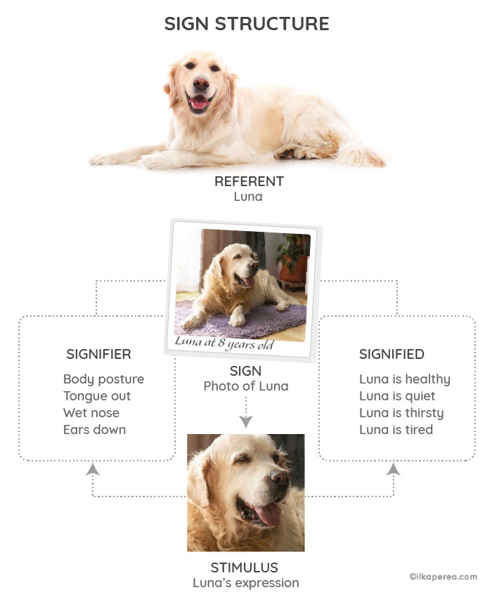
Sign has been defined in many ways, both functionally and by its components. When reviewing some definitions, several terms come to mind:
- the stimulus: it is the physical signal that is used
- the signifier: is the model in which the stimulus is a manifestation
- signified: it is the concept or mental representation of meaning, which can be
- logical or
- psychological
- the referent: is what we are talking about when we use a particular sign
The sign is the unit produced by combining one or more of the terms described above.
Sign Components
The stimulus is the perceivable physical element (for example, the photograph or something in the photograph) that serves as the substrate on which the signifier manifests itself.
The signifier is the physical model; for instance, the dog, body posture or expression, location, or size, of which the stimulus is a manifestation.
The signified is the mental concept contained in the sign. It is often divided into semes, which are semantic characteristics (indicated by diagonal bars). For example, the signified for “rose” is the sum of semes as / flower /, / red /, and so on. Seme is the smallest unit of meaning recognized in semantics.
As the sign is the photograph of Luna, the signifier “tongue out” and the associated concept “thirst” have been taken. The signified is: “Luna is thirsty”.
The concept is the mental representation corresponding to the signified. As well as the referent, the concept is the most problematic term to describe. It has been defined in numerous, sometimes contradictory ways. The concept is sometimes seen as a logical element, sometimes as a psychological element; sometimes as a universal or general element (one that does not show significant variation from one individual to another), and sometimes as an individual element. It seems that the theories that incorporate the logical concept as part of the sign do not incorporate the psychological concept and vice versa.
The referent can correspond to a concrete element (the cat is shown in a drawing of a cat) or an abstract element (love, represented by the icon of a heart). It can correspond to a real element or a fictional one.
Visual Signs

What are the visual signs?
Visual signs can take different forms. For instance, they can be a logo, a geometric figure, a photograph, graffiti, or traffic signs. Despite being in different forms, Charles Sanders Peirce, another founder of semiotics, classified signs into three types: Index, Icon, and Symbol.
Index
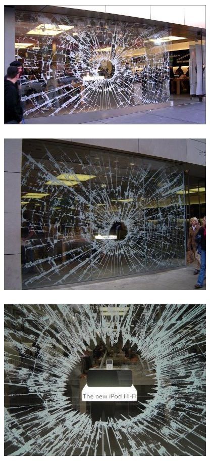
An index is a sign formed from some physical remnant of the elements represented. Indexes, signs, or traces are all those signs that maintain a physical relationship with their referent; there is a real connection with the objects. In a few words, there is a cause-and-effect relationship.

For example, footprints in the sand can indicate whether it was a person, an animal, or a vehicle. In the image of the beach, the person is not present, but the footprint gives evidence of their walk in that area. It can even be determined if the person was barefoot or wearing shoes, whether they were an adult or a small child.





Index Summary
- Definition: physical remnant of elements represented, i.e., the effect of a cause.
- Key Words: trace, residual, effect.
- Key Question:
- Is it a clue or evidence?
- What cause does this effect represent?
Icon
An icon is a direct imitation of the object or concept it represents.

With icons, there is a real connection between the signifier and the signified. Icons have a physical resemblance to what is represented. A photograph is an example of an icon sign. Take a picture of a tree, and the resulting image will look like that tree. Paintings and sculptures are also examples of icon signs.

A Selfie for VanGogh
Samsung Electronics presents the campaign “For self-portraits. Not selfies.” for the NX Mini camera.

Based on Van Gogh’s famous self-portrait, Samsung recreates the environment where the work was painted. The concept of icon is used to maintain the relationship between selfies and self-portraits.
Icon Summary
- Definition: direct imitation of the object or concept it represents.
- Key Words: imitation, similarity, resemblance.
- Key Questions:
- What does it look like?
- What does it resemble?
Symbol
Symbols are signs that have lost all relation to the characteristics of the represented object but that have acquired a meaning.

The symbols are at the opposite ends of the icons. The connection between signifier and signified in symbols is completely arbitrary and must be learned culturally. The relationship between this type of sign and its object is established by a specific, culturally established law or norm; there is no common shared code; therefore, it is not universal.
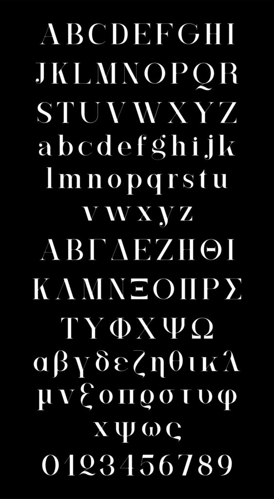
There is no logical connection between a symbol and what it represents. The connection must be learned and is usually associated with the concept it represents within a context. For example, language, numbers, flags, and musical notes are symbols. What they communicate must be learned.

Symbol Summary
- Definition: It does not have a relationship with the characteristics of the represented object but acquires a meaning.
- Key Words: without connection, or arbitrary meaning, it must be learned culturally.
- Key Questions:
- Is it the effect or the evidence of its meaning? (NO)
- Does it resemble what it means? (NO)
- Was its meaning learned? (YES)
An icon or index can also become a symbol over time through repetition. There is some misunderstanding about the visual signs that cause errors when graphic designers try to apply them. I would like to explain two of them.
Difference between icons and symbols
Usually, symbols represent an abstract concept and may be linked to an icon or an index.
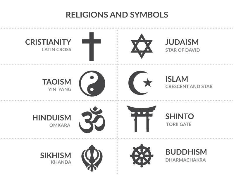
To clarify this point we have, for example, the Latin cross. The Latin cross is an icon, in that it bears a physical similarity to the cross on which Jesus was crucified, as dictated by the Christian tradition.
The similarity is in their shape. The Latin cross can vary in materiality, it doesn’t have to be made of wood for it to retain its resemblance to the one used by the Romans for crucifixions.

However, the first Christians took the Latin cross to identify themselves among themselves, as a representation of the new religious doctrine, the symbol of the New Gospel.
The relationship between the Latin cross and the faith professed by a group of Jesus’ followers is arbitrary; their relationship is not one of cause and effect (index) nor is it one of physical likeness (icon). Religion is an open and subjective concept. It is here that of all the available icons, Christians choose the shape of the cross where Jesus died as a symbol of their faith.

This same case can be applied to the Star of David. It has an icon that is the star, but it is the symbol of Judaism.
The “icons” that aren’t icons…
Today the term “icon” is linked to the graphics we see on the web or in user interfaces to describe a function or activity.
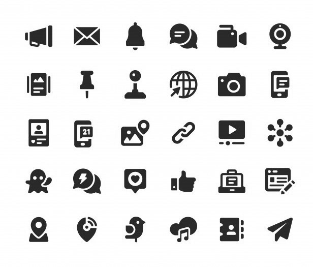
When computer user interfaces were first created, most of the signs were imitations of real objects. For example, the printer, the folder, and the floppy disk. This is the reason we refer to all signs on user interfaces as “icons”.

Of course, the original signifiers used were icons in the sense that they resembled what they represented. In the past, documents were stored on floppy disks or disks, for which a similar icon was designated. Floppy disks have now been replaced by larger and more secure equipment and storage systems, even though they are no longer physical but digital. Now there is the “cloud” whose icon is a cloud but is the symbol of a digital storage service over the Internet.


Similarly happened with the e-mail symbol. As you know, its icon is an envelope similar to the one used to send letters to the Post and Telegraph Office. Now that same envelope icon symbolizes the function of sending an e-mail. Another example is the paper plane icon that symbolizes the “send (message)” function.
Summary
- Signs can be defined as those that refer to or represent something else, which is absent.
- A signifier can have more than one signified.
- Sign structure can be compounded by the stimulus,
the signifier, signified, and the referent. - Signs are classified into three types: Index, Icon, and Symbol.
- An index is a sign formed from some physical remnant of the elements represented.
- An icon is a direct imitation of the object or concept it represents.
- Symbols are signs that have lost all relation to the characteristics of the represented object but that have acquired a meaning.
Some Insights
As we have already seen, there are three types of visual signs: index, icon, and symbol. Clearly, we can conclude that all logos representing a brand are symbols. In this sense, it is easy to understand that all photographs are icons. However, differentiating the types of signs we see often causes a lot of confusion when we are not truly clear about the definition of each one. A very practical exercise that can help you classify the signs correctly is to make a comparative chart.
Once the concepts of visual signs are clear, it will be easier to understand the codes of visual language to create strong and meaningful designs with connotative messages and engage your audience.
Any Thoughts?
In the comments section, tell me if you already knew about visual signs. As a designer, which of these signs do you apply the most to your projects?

Share
Spread the love… and this post!
If you liked it, share this post on your social networks. Smart designers share good things with others.

Bibliography
- Chandler, D. (2017). Semiotics: The Basics. Routledge.
- Groupe µ (2011). Tratado del signo visual: Para una retórica de la imagen (Signo E Imagen / Sign and Image). Ediciones Cátedra.
- Hébert, L. (2019). An Introduction to Applied Semiotics. Routledge.
- Hébert, L. (2006). Sign Structures. The Sign according to Klinkenberg. Signo. http://www.signosemio.com/klinkenberg/sign-structures.asp.
- Leborg, C. (2006). Visual Grammar: A Design Handbook (Visual Design Book for Designers, Book on Visual Communication). Princeton Architectural Press.
- Poulin, R. (2018). The Language of Graphic Design Revised and Updated: An illustrated handbook for understanding fundamental design principles. Rockport Publishers.

