Choosing the Right Logo Type
Last Updated on May 9, 2024 by Ilka Perea Hernández
Designing a logo that represents and makes a brand stand out requires an understanding of the different types of logos. Each type has its own characteristics; therefore, choosing the right logo type is essential to effectively communicate the brand’s identity and values.
By exploring the details of each type, designers can create a logo that captures attention and establishes a lasting impression in the minds of consumers. In this post, I will explain the different types of logos and recommend their best application and use.
Logo

What is a Logo?
A logo is a visual representation of a brand, gathering its identity, values, and promise. At its core, a logo is more than just a design; it is a symbol of trust, quality, and reliability. It guides consumers to associate a set of attributes and emotions with the brand it represents.
Whether through bold graphics, elegant typography, or a harmonious combination of both, a well-designed logo can leave a lasting impression, ingraining itself in the collective consciousness of audiences worldwide. In other words, a logo acts as a powerful communicator, distilling the essence of the brand into a singular visual identity that transcends language and cultural barriers.


As designers, there are several concepts and variables to take into account when designing a logo. One of these variables is the type of logo that best suits the visual representation of a brand.
Choosing the right type of logo for a brand requires careful consideration of its identity, values, target audience, and intended market positioning. By leveraging the unique characteristics of each logo type, designers can create a visually compelling and memorable brand identity that resonates with consumers and fosters long-term brand loyalty.
Logo Types

Logo Types by Components
It is possible to classify logos by the elements of which they are composed. Several designers worked together to identify these types of logos. From Walter Dorwin Teague, who is credited with the introduction of the “logotype” for the graphic representation of a brand, to Massimo Vignelli, Louis Danziger, and Joan Costa. Among them, I would like to highlight Massimo Vignelli, an Italian designer, known for using terms such as “isotype“, “imagotype“, and “isologo” to describe how text and images could be combined in logos. Choosing the right logo type requires knowing the elements of the logo and how they work together.
Logotype
Think Text Superstar
A logotype is essentially a fancy way of saying a logo made entirely of text, typically the brand name. The design emphasis lies in typography, using fonts, letterforms, and text arrangements to create a memorable and distinctive visual representation of the brand name.
Examples: Coca-Cola’s script, FedEx’s arrow-integrated lettering, or Google’s colorful logotype are all prime examples.


Isologo
The Inseparable Duo
An isologo combines an image (usually symbolic) with the written name of the brand, but with a twist — they become inseparable. The image and text elements are designed to work together as a single unit, creating a strong and recognizable brand mark. Cohesion is Key. The success of an isologo hinges on how well the image and text complement each other visually and conceptually.
Examples: Burger King’s logo with the brand name, Amazon’s smiling arrow incorporated with the brand name, or Land Rover’s ellipse and the brand name are all classic isologos.

Imagotype
Independent Elements
An imagotype combines a graphic element (often a symbol or icon) with the brand’s written name. The key difference from an isologo is that the image and text in an imagotype can function independently. Versatility is King. This flexibility allows for easier adaptation across different marketing materials.
Examples: Shell (the seashell symbol and the brand name), Warner Bros. (shield and the studio name), and Levi’s (the red tab and the brand name) are examples of the logo approach.


Isotype
Simplicity Speaks Volumes
An isotype is the quiet achiever of the logo world. It’s a symbolic image that represents a brand without any text. Effective isotypes are simple, memorable, and capture the brand’s essence.
Examples: Imagine Apple’s bitten apple icon standing alone, the camera on Instagram’s logo, or PlayStation’s initial letters. That’s the power of an isotype — instant brand recognition through a strong visual symbol.


Here’s a table summarizing the key differences:
| Feature | Logotype | Imagotype | Isotype | Isologo |
|---|---|---|---|---|
| Focus | Text | Image & Text | Image | Image & Text |
| Text Importance | High | Medium | Low | Medium |
| Image Importance | Low | High | High | High |
| Design Emphasis | Typography | Image & Text Cohesion | Symbolism | Image & Text Cohesion |
| Elements Function Separately | No | Yes | No | No (Ideally) |
| Brand Recognition | Relies on Text | Relies on Both | Relies on Image | Relies on Both |
Logo Types by Topology
In her book “Designing Brand Identity”, Alina Wheeler shares a classification of brand marks. This categorization provides a perspective on the logo considering its shape, and not so much on its component elements as in the previous classification. This guide will break down the logo types into wordmarks, letterforms, pictorial marks, abstract/symbol marks, and emblems.
Wordmarks
Typography Takes Center Stage
A wordmark is a logo that uses only the brand name itself and is presented stylishly and memorably. The design focus is on typography, using fonts, and text arrangements to create a unique visual representation of the brand name.
Examples: Marvel, Uber, Hugo Boss, Google, Netflix, Bulgari, Capcom and Visa are all iconic examples.


Letterforms
Creative Typography Play
Similar to a wordmark, a letterform logo focuses on the brand name, but is more distinct! Here, the letters themselves are designed creatively and distinctively, often incorporating imagery or symbolism related to the brand.
Examples: FedEx (where an arrow is cleverly hidden between the “E” and “X”), DC Comics, Under Armour, Tesla Motors, New Balance, and Subway are creative letterform logos.


Pictorial Marks
Pictures Worth a Thousand Words
A pictorial mark, also known as a logo symbol, uses an image or icon to represent the brand. Effective pictorial marks are simple and memorable, and visually communicate the brand’s essence. The goal is for the image to be instantly recognizable and evoke the brand without the need for text.
Examples: Starbucks, Apple, Instagram, Shell, Crocs, YouTube, and Dropbox.


Abstract/Symbol Marks
Thinking Outside the Box
Unlike pictorial marks that use representational imagery, abstract/symbol marks are more conceptual. They use geometric shapes, lines, or other non-representational elements to convey a brand’s message or values. They evoke emotions. These abstract symbols create a strong brand association without directly depicting a product or service.
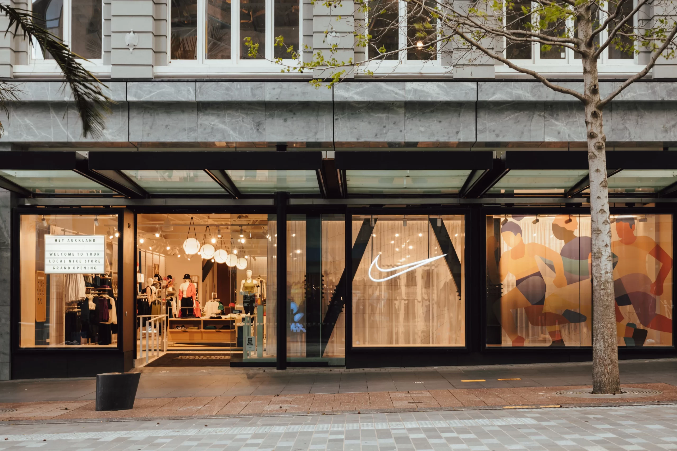
Example: Nike, Chase, Microsoft Copilot, Olympics, HSBC, and XBOX.


Emblems
Classic and Detailed
Emblems are a more traditional logo style, often featuring a crest-like design that incorporates a pictorial element, text, and sometimes even a motto. They are rich in history. Emblems often evoke a sense of heritage and trustworthiness. Emblems can be quite detailed and may not always translate well to smaller applications.
Example: Harley-Davidson, Porsche, Harvard, Peugeot, Breitling, and Stella Artois.

Another table summarizing the key differences:
| Feature | Wordmark | Letterform | Pictorial Mark | Abstract/Symbol Mark | Emblem |
|---|---|---|---|---|---|
| Focus | Text | Text (Creative) | Image | Abstract Form | Image & Text |
| Text Importance | High | High | Low | Low | Medium |
| Image Importance | Low | High (Creative) | High | High | High |
| Design Emphasis | Typography | Creative Typography | Imagery | Symbolism | Imagery & Text |
Summary
- A logo is a visual representation of a brand, gathering its identity, values, and promise.
- The types of logos according to the components are logotype, isotype, imagotype, and isologo.
- A logotype is made entirely of text, typically the brand name.
- An isologo combines an image (usually symbolic) with the written name of the brand; however, they become inseparable.
- An imagotype combines a graphic element (often a symbol or icon) with the brand’s written name, and both can function independently.
- An isotype is a symbolic image that represents a brand without any text.
- The types of logos according to the topology are wordmarks, letterforms, pictorial marks, abstract/symbol marks, and emblems.
- A wordmark is a logo that uses only the brand name itself.
- A letterform logo focuses on the brand name, designed creatively and distinctively.
- A pictorial mark uses an image or icon to represent the brand.
- An abstract/symbol mark is a conceptual representation of a brand.
- Emblems are a more traditional logo style, often featuring a crest-like design that incorporates a pictorial element and text.
Some Insights
While there’s no need to be a logo encyclopedia, understanding the different logo types and how they function is key to creating a perfect match for a brand. Choosing the right logo type goes beyond aesthetics; it’s about strategic communication. However, everything starts with understanding the brand’s core, values, and promise. The brief is a great place to start.
Client Brief
This is your roadmap! A well-defined brief from the client provides crucial information about the brand’s personality, target audience, and desired emotions the logo should evoke. By understanding these logo types and how they align with the brand’s core and the client’s vision, you can decide on the most suitable approach.
Visual Identity
The logo is the first step in building a solid, coherent, and strong brand identity that should visually represent the essence of the brand: its values, its mission, and the promise it offers to customers. But the work does not end there. A visual identity manual must be created to ensure the proper use and reproduction of the logo across different media and platforms. This ensures a consistent visual identity.
Logo Design Trend: Reduced Versions
The trend is to change logos for a disconnected version, that is, to create imagotypes that can then function separately for both parts (symbol and text). This trend gained more strength with the use of favicons in the tabs of web browsers and with images for the profiles of brands’ RRSS accounts. In both cases, 1:1 (square) images are required, so a reduced version of the logo is highly desirable. These specifications should also be detailed in the visual identity manual.


Some Literature
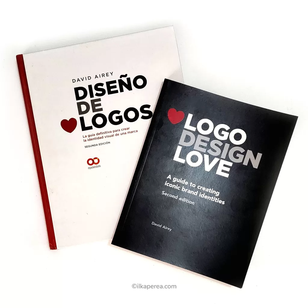
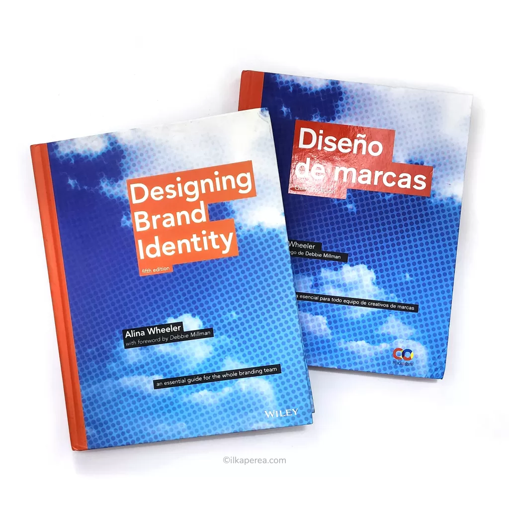
I want to recommend two extraordinary books that could help you learn about branding:
- Designing Brand Identity by Alina Wheeler
- Logo Design Love by David Airey
Any Thoughts?
In the comments section, tell me if you already knew about these different types of logos. As a designer, have you designed logos, and what has your experience been like?

Share
Spread the love… and this post!
If you liked it, share this post on your social networks. Smart designers share good things with others.

Bibliography
- Aaker, D. A. (1996). Building Strong Brands. Free Press.
- Aaker, D. A. (2004). Brand Portfolio Strategy: Creating Relevance, Differentiation, Energy, Leverage, and Clarity. Free Press.
- Aaker, D. A., & Joachimsthaler, E. (2000). Brand leadership. Free Press.
- Airey, D. (2015). Logo Design Love (2nd ed.). Pearson.
- Kotler, P., & Keller, K. L. (2016). Marketing Management (15th ed.). Pearson.
- Wheeler, A. (2017). Designing Brand Identity: An Essential Guide for the Whole Branding Team. John Wiley & Sons.
