
Pantone Color of the Year 2022: Very Peri
Last Updated on December 28, 2023 by Ilka Perea Hernández
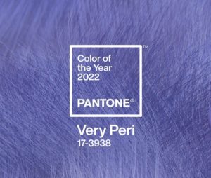
Pantone Color Institute has announced the Pantone Color of the Year 2022: Very Peri. A color that symbolizes the spirit of the current global era, full of transitions and changes.
As it does every December, the Pantone Color Institute presents to the creative community the Pantone Color of the Year, an effort that has been going on for more than 20 years. Among color profiles, graphic designers rely on the Pantone Matching System to choose accurate colors.
Very Peri: The Chosen One
Why Very Peri has been chosen as Pantone Color of the Year 2022?
PANTONE 17-3938 Very Peri combines the fidelity and constancy of blue with the energy and excitement of red. A versatile shade that conveys creativity, connection, and dynamism. It reflects the need of our time to adapt to the changes and transitions of a globalized world, demanding new ideas, a society that is in constant innovation.
“The Pantone Color of the Year reflects what is taking place in our global culture, expressing what people are looking for that color can hope to answer.” — Laurie Pressman, Vice President of the Pantone Color Institute.
It is intended to encourage creativity, harmony, and enthusiasm with this beautiful warm blue tone like lavender but more saturated. The casual and almost ambiguous character of Very Peri invites us to imagine without inhibitions, bordering on fantasy.
According to the announcement via webinar, the color key words are:
- courageous
- empowering
- spritely
- joyous
- dynamic novel
- presence
- imaginative
- whimsical aesthetic
- futuristic
Some Insights
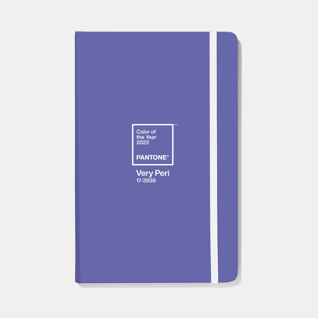
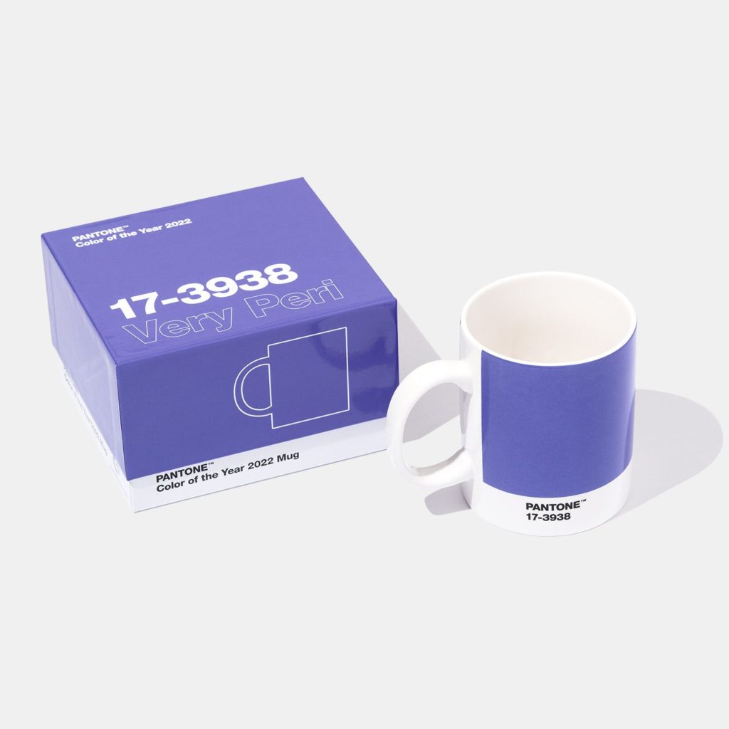
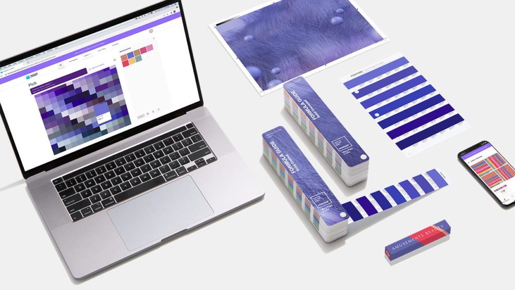
Exercise your chromatic taste by bringing this spontaneous and dynamic color into your designs. You can review the palettes and harmonies that Pantone suggests on the website. However, my recommendation is to have fun creating your own.

To understand the relevance of Pantone Color of the Year, read the following post:
Share
Spread the love… and this post!
If you liked it, share this post on your social networks, such as Facebook, LinkedIn, or Twitter. Smart designers share good things with others.
Bibliography
- Dabner, D., Stewart, S., Vickress, A. (2020). Graphic Design School: The Principles and Practice of Graphic Design. (7th ed.) Wiley.
- Malamed, C. (2009). Visual Language for Designers: Principles for Creating Graphics That People Understand. Rockport Publishers.
- Pantone. (n.d.). Design With Pantone Color Of The Year 2022. Retrieved December 9, 2021, from https://www.pantone.com/color-of-the-year-2022-tools-for-designers
- Pantone. (2021, December 8). PANTONE 17-3938 Very Peri, the Pantone Color of the Year 2022. [Video]. YouTube.
- Poulin, R. (2018). The Language of Graphic Design Revised and Updated: An illustrated handbook for understanding fundamental design principles. Rockport Publishers.
1 Comment
Join the discussion and tell us your opinion.
[…] Pantone Color of the Year 2022: Very Peri […]