

What stand RGB, CMYK, and PMS? — Color Profiles for Graphic and Digital Design
Last Updated on: 21st March 2024, 03:05 am
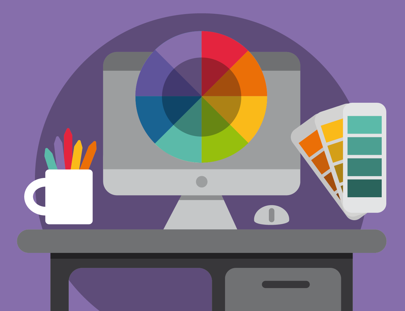
One of the priorities for designers is to maintain color consistency across a range of media. For them, it is crucial to understand the difference between distinct color profiles for graphic and digital design.
How many times has it happened to you that your design, for example, a logo, shows inconsistency between the colors printed on billboards, brochures, business cards, or displayed on websites? Color inconsistency is a real problem that detracts from brand strength.
The first step to solving that problem is to understand the three modes of color used in the graphic and digital design industry. RGB, CMYK, and PMS are industry standards for color profiles. If you want your design to look the way you want it to look, you must understand each of these color profiles, the difference between them, and when to use them.
Table of Content
- RGB Profile
- Color Profile for Displays and Screens
- CMYK Profile
- Color Profile for Printing
- How does CMYK printing work?
- PMS Profile
- Color Profile for Accurate Color Printing
- Process Colors vs Spot Colors
- What is the difference between process colors and spot colors?
- Process colors
- Spot colors
- So, when should spot colors be used?
- Some Insights
RGB Profile
Color Profile for Displays and Screens
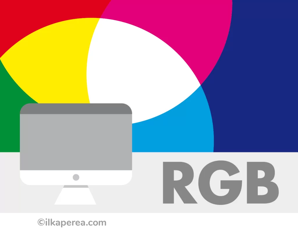
RGB, also known as additive colors, stands for Red, Green, and Blue. It is a color profile in which red, green, and blue are combined to produce a range of colors. Hexadecimal values also come from this color mixing.

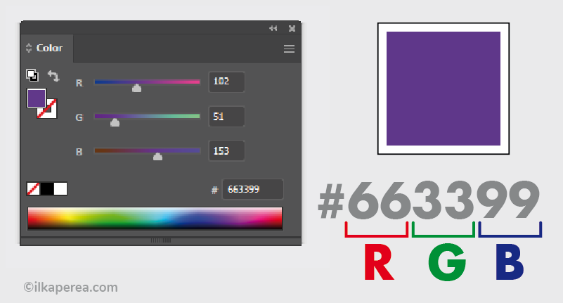
A hexadecimal color is essentially a code consisting of numbers and letters that describe an RGB color. This color code is often used in the CSS code of websites. They are easily recognized because they start with the pound sign (#). For Instance, code #663399 corresponds to a violet shade.
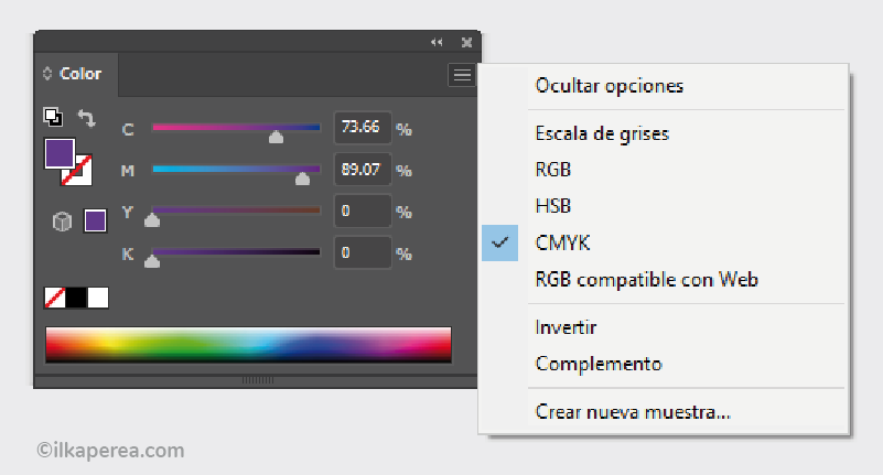
In digital platforms and software, it is possible to set the values for a specific color in RGB. To do this it is important to understand that 0, 0, 0, 0, creates the color black, and 255, 255, 255 creates white. This is because RGB colors are created through light. The absence of color in darkness, the totality of colors produces light. All values between 0 and 255 produce the range of colors we see on computer screens, cell phones, televisions, videos, and digital photos.
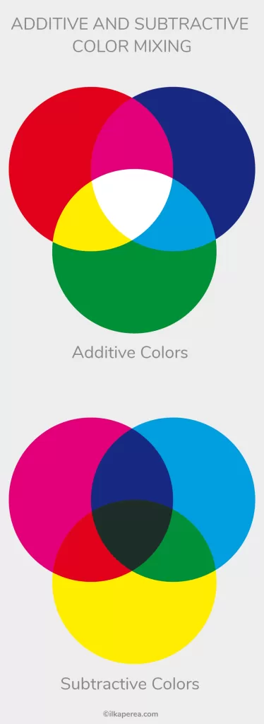
Additive Colors vs Subtractive Colors
Essentially, additive colors reflect light. In other words, they are optical mixing of light. Subtractive colors absorb light. They are mechanical pigmentation mixing basic colors.
RGB is considered an additive color model because it adds color to black by using light to create white. CMYK is subtractive because the color itself subtracts the white from the paper as it is laid down.
CMYK Profile
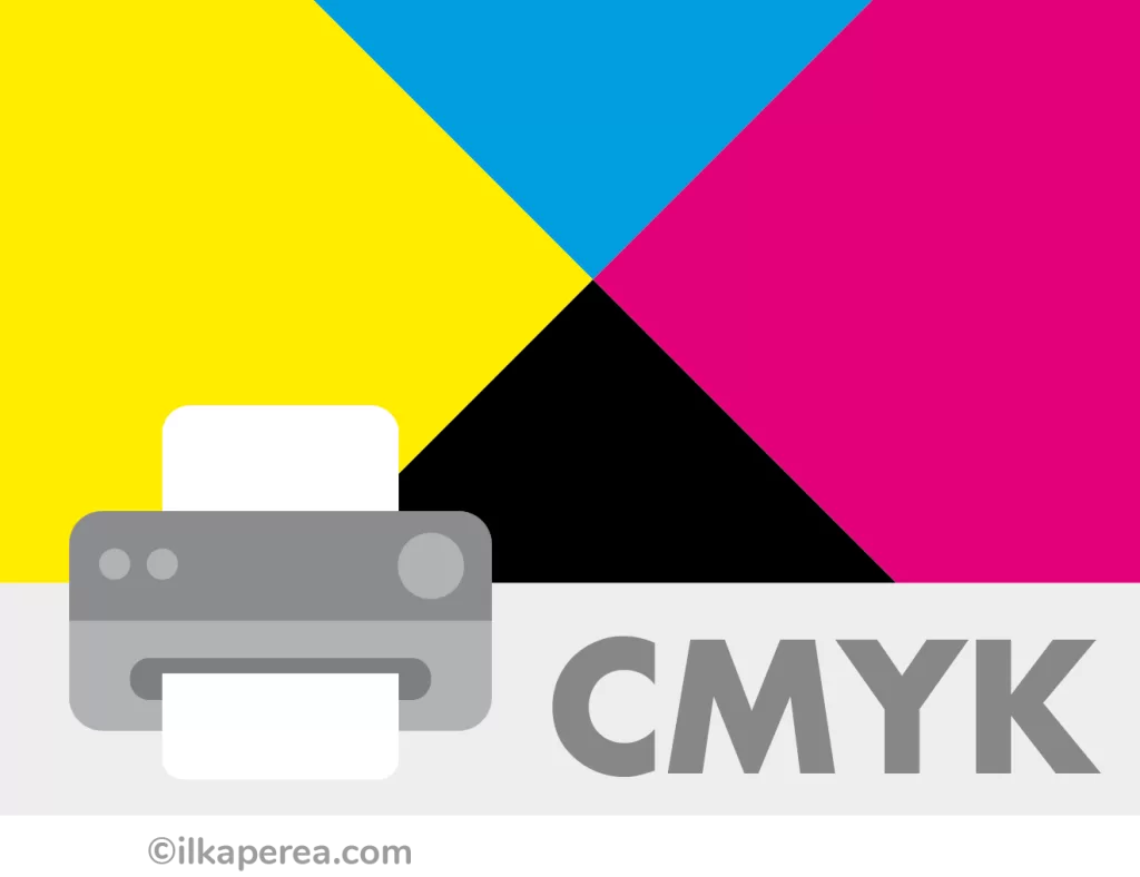
Color Profile for Printing
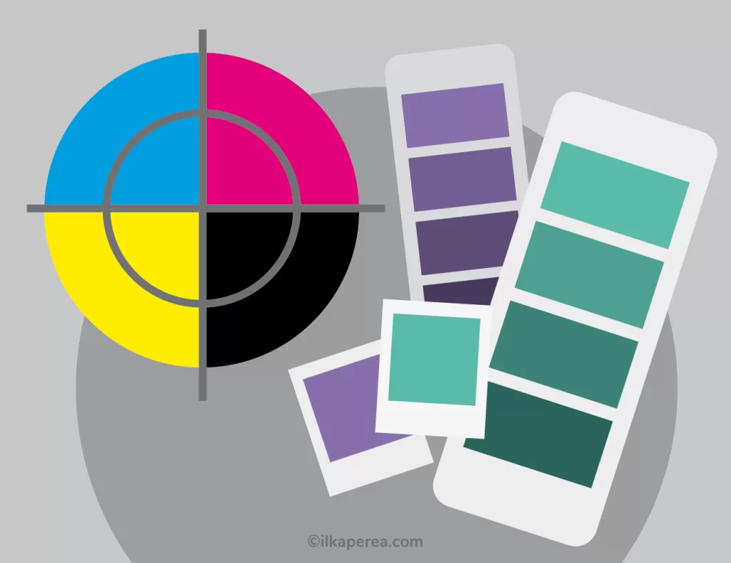
On the opposite side to RGB is CMYK whose abbreviation this time stands for Cyan, Magenta, Yellow, and Black (K is used for black instead of B because B already stands for blue).
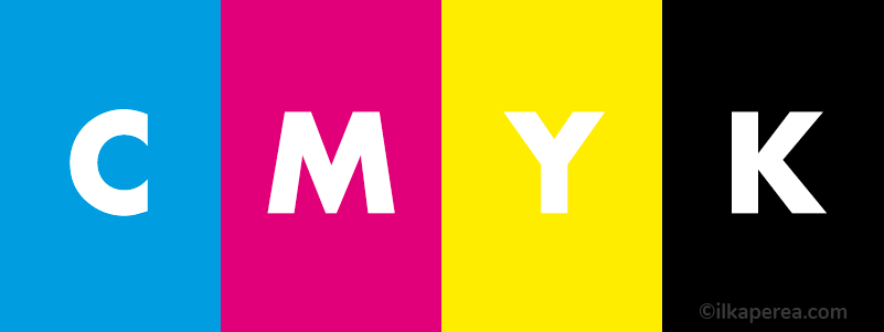
As explained above, the CMYK is a subtractive color profile. Like RGB, CMYK is composed of four numerical values to create the final color. These numbers are measured as percentages based on the intensity of the color ink. If all four colors were set to 100%, a true black would be created. For this reason, CMYK is referred to as process color or four-color process.
In fact, CMYK is the color mode used in printing because cyan, magenta, yellow and black are the four ink colors used in most printing processes, including home inkjet printers.
Not all RGB profiles can be reproduced in CMYK and vice versa. For this reason, when using color profiles for printed graphic design it is important that complete designs are converted to CMYK before sending them to print. Often, graphic designers forget that the photos are still in the RGB profile and send in the design under these conditions. The result is a very faded printed photograph.
How does CMYK printing work?
Graphic designers must prepare the file to be printed in CMYK. In printing, the colors of the design are separated into 4 plates or screens that will each be inked with one color: one plate with cyan, one with magenta, one with yellow ink, and one with black. These plates function as presses. The colors are printed one after the other to recreate the original image. Each ink is superimposed on the surface to recreate the range of colors. For this reason, this method is known as 4-color, full-color, or standard process printing.
PMS Profile
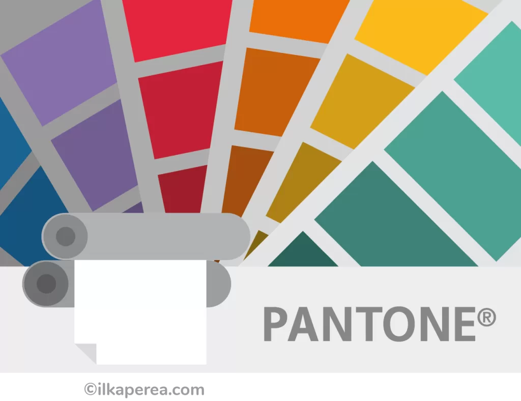
Color Profile for Accurate Color Printing
Color is very subjective, which is why the Pantone Matching System® works so great, taking all the guesswork out of color identification.
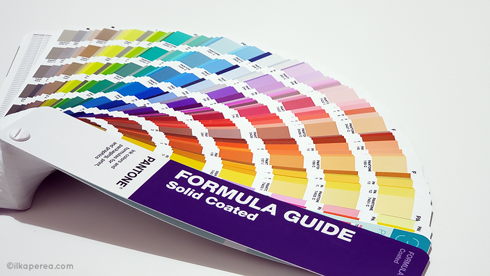
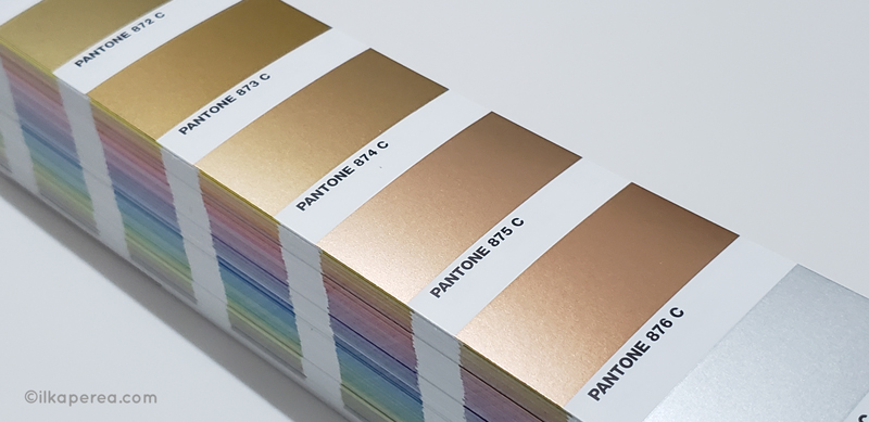
One of the color profiles used for graphic and digital design is Pantone®. PMS stands for Pantone Matching System. Pantone has over 1,000 spot colors defined by a formula that ensures a match between the desired color and the ink color.
Using Pantone Colors in Graphic Design ensures consistent colors across all platforms so people in separate locations can refer to the same color using the Pantone Color Guide. Each color is assigned a “PMS” number which identifies the exact color needed. The use of PMS inks is called spot color printing.
Process Colors vs Spot Colors
What is the difference between process colors and spot colors?
In addition to RGB colors, CMYK colors, and PMS colors, designers must know about spot colors and process colors for printing. The most important choice they must make when it comes to ink is whether to use spot colors (Pantone Matching System®) or CMYK process printing as each color system has significant differences.
Process colors
Graphic designers use process colors for process printing (also called 4-color process printing or CMYK printing). Process printing refers to the technique of printing a full spectrum of colors using halftones of only 4 overlapping ink colors: Cyan, Magenta, Yellow, and Black (or CMYK). In process printing, the colors are not mixed. Each ink is placed on individual plates or screens and overlaid on the paper.
Spot colors
Instead, spot colors are printed with a single ink. Often these inks are physically mixed to obtain different shades or hues. A formula from a Pantone guidebook is used in a standardized way. Spot colors have a wider gamut than CMYK colors. Some colors simply cannot be produced with CMYK, for example, colors such as reflex blue, fluorescent orange, or metallic gold.
Despite the convenience of using spot colors, there are design projects in which it is not convenient to use them. This is due to the high production costs involved with Pantone colors compared to process colors.
With spot colors, the presses must be washed to remove the Pantone ink used to place the next ink of another color. This is an additional step in the printing process that is not necessary to do with CMYK printing. Since the CMYK printing process always uses the same base colors, it is a more cost-effective solution.
So, when should spot colors be used?
Graphic designers use spot colors when they are designing:
- Consistent branding/logos: Pantone colors ensure that reliable and accurate colors will be reproduced throughout all printed material (including digital material).
- Colors outside the CMYK gamut: Some colors simply cannot be produced with CMYK, such as fluorescents or metallics.
Some Insights
Certainly, selecting the right color space to work with for each project can be especially important depending on the result of the project. In short, if the designer is creating a post for social media, a web banner, or anything that will be viewed on a screen, RGB is used. For anything that will be printed, CMYK mode is chosen. But if printing requires color accuracy, Pantone colors are the best choice. Many printers and graphic designers use it to offer their customers reliable and reproducible colors.
In addition, Pantone offers additional color and design tools to match the Color of the Year announcement. Since 2013, designers from different branches of design, including product manufacturers, have had access to several Pantone Color System tools available to create on-trend products and graphics related to Color of the Year.
Share
Spread the love… and this post!
If you liked it, share this post on your social networks. Smart designers share good things with others.
Bibliography
- Dabner, D., Stewart, S., Vickress, A. (2020). Graphic Design School: The Principles and Practice of Graphic Design. (7th ed.) Wiley.
- Campi, I. (2020). ¿Qué es el diseño? Editorial Gustavo Gili.
- Malamed, C. (2009). Visual Language for Designers: Principles for Creating Graphics That People Understand. Rockport Publishers.
- Munari, B. (2019). Diseño y comunicación visual: Contribución a una metodología didáctica (2a ed.) Editorial Gustavo Gili.
- Poulin, R. (2018). The Language of Graphic Design Revised and Updated: An illustrated handbook for understanding fundamental design principles. Rockport Publishers.