

What are PMS Colors? Using Pantone Colors in Graphic Design
Last Updated on: 10th August 2023, 03:13 am
For effective use of color in commercial offset printing, graphic designers must know the two main ways to produce color on paper from ink: CMYK printing, or 4-color process; and the Pantone Matching System (PMS). Using Pantone Colors in Graphic Design ensures consistent colors across all platforms so that your audience receives the same impression in each design.
As a graphic designer, imagine clients trying to describe in words the specific color they want for their designs, but oral communication does not work. Imagine having to do the same with printers for every design project. How do you get everyone on the same page with the almost infinite variety of color shades that can be produced?
Using descriptive names such as “acid green”, “amethyst”, “arctic lime”, “Barbie pink”, or “cobalt blue” can be an ambiguous method, as it is challenging to be sure that everyone involved in the design process perceives that color in the same way.
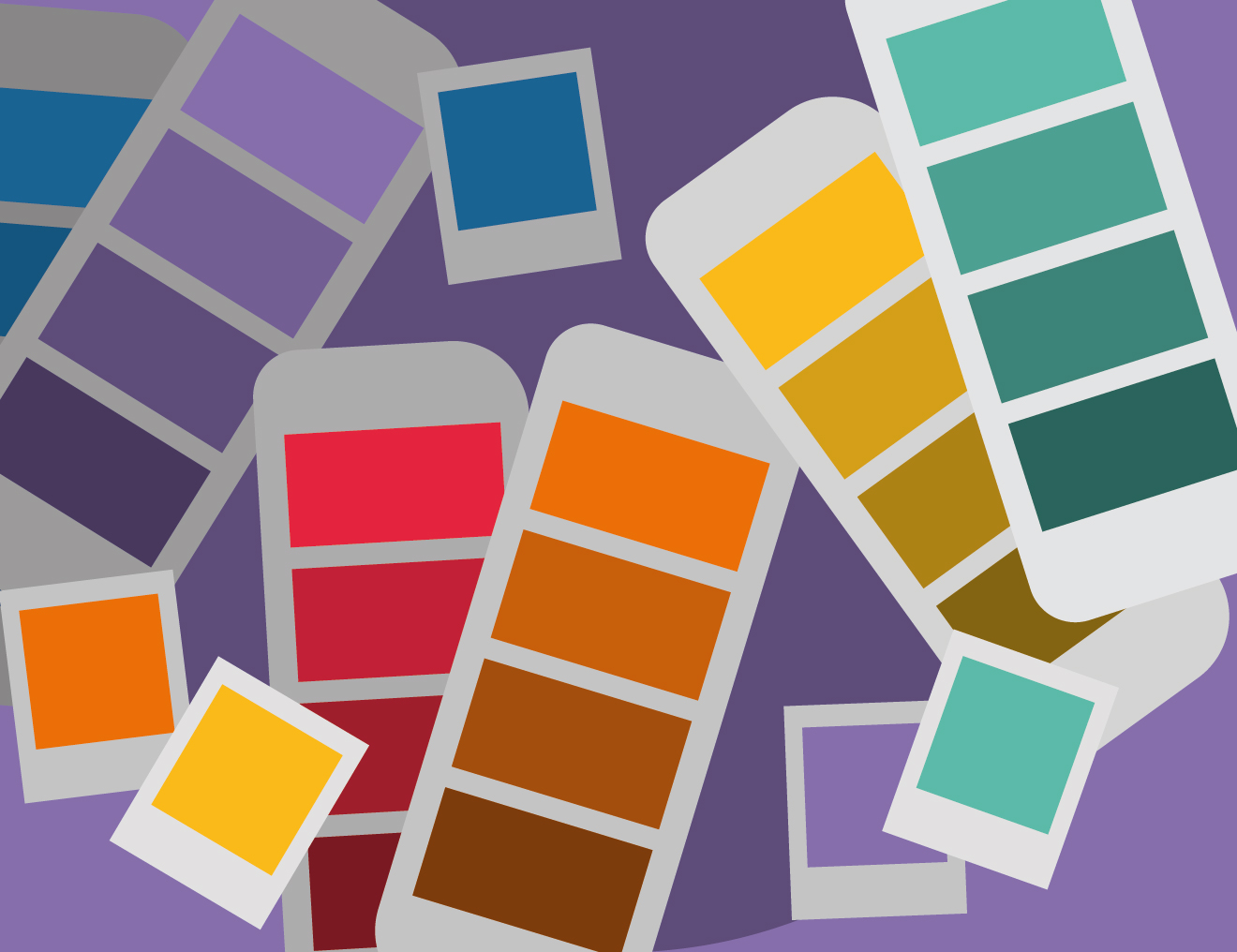
Designers use the Pantone Matching System (PMS), which is the standard language for color communication. It is a registered system that describes colors by numbers (e.g., “PMS 18-3838″…one of my favorites).
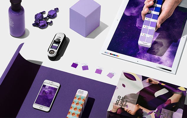
Table of Contents
- The Pantone Color Matching System
- What are Pantone colors?
- What is the meaning of Pantone?
- What are PMS colors?
- How do Pantone colors work?
- What stand TCX and TPX/TPG?
- What are the benefits of Pantone colors?
- PMS Colors and Graphic Design
- How to use Pantone Colors in Graphic Design
- Considering the costs
- What is the difference between CMYK and PMS?
- Printing Process
- Using Pantone colors for branding
- Using Pantone colors on the Web
- Some Insights
- Pantone Color Guide Replacement
[cite]
The Pantone Color Matching System

What are Pantone colors?
The Pantone Color System is the world’s most standardized color-matching system. It achieved standardization in the design, printing, and product manufacturing industries due to its ease of use and user-friendly handling thanks to its fan format and shade and hue classification by numbers.
Pantone colors are defined by a formula. The formula developed by Pantone results in spot colors. This means that the color is created from a palette of eighteen (18) basic colors. Using Pantone colors in graphic design ensures a match between the desired color and the ink color because everyone is using the same codes and the same technical language.
The Pantone Color Institute not only offers standardized, easy-to-use technical language to the design industry. They also provide relevant information on how colors affect consumers by knowing in advance about the latest trends.
What is the meaning of Pantone?
Pantone means “all colors”. It is the combination of the Greek prefix “pan” meaning completeness; and the English word “tone”. In 1963, Pantone developed the first color matching system.
What are PMS colors?
In brand books, visual identity guidelines, or printing requests, the abbreviation PMS can be frequently found. PMS stands for Pantone Matching System. PMS abbreviation is standardly used worldwide.
How do Pantone colors work?
Pantone is, as explained above, a standard “color matching system” in which a code number is used to identify each color. Therefore, it is easy to identify any color with the help of the Pantone Color Guide, because each color has a different or unique code number.
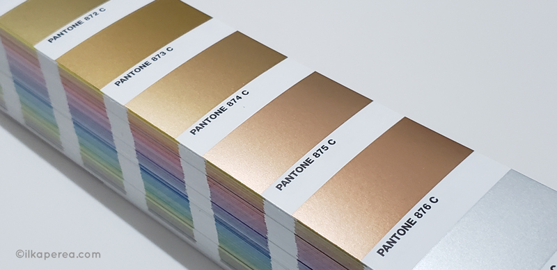
In detail, there are more than 1,000 colors identified in the Pantone Color Matching System, including metallic and fluorescent colors. These numerical codes are accompanied by a suffix, a letter. The suffix code refers to the material on which the color is printed.
Thus, we have that:
- C stands for coated paper.
- U for uncoated paper.
- M for matte paper.
- TCX for textile cotton system.
- TPM for metallic finishes.
By using Pantone colors in graphic design, people in separate locations can refer to the same color knowing only the number that identifies it. Inspectors typically verify product color by comparing the product color to the code listed in the specification and the Pantone color guide in hand.
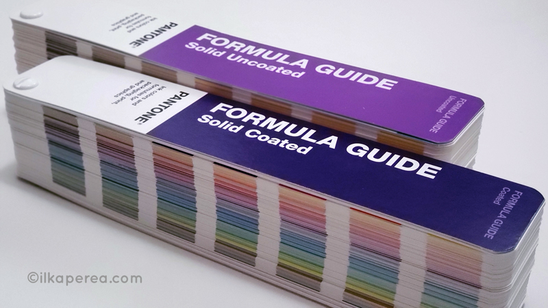
To avoid errors such as color deviation between the design and the finished product, both the manufacturers and the designers must update their color guides. The inks printed on the color swatch may fade and yellow over time. In addition, the latest guides usually have new colors. For example, 294 new colors were added in 2019 to Formula Guide: Coated & Uncoated.
What stand TCX and TPX/TPG?
Pantone TCX and TPX guides play a key role in the textile industry. They are used in the dyeing and printing of fabrics. These guides may not be directly related to graphic design, but designers should know what these guides are about and not misuse them.
Pantone Textile Color System guides are used for color matching, but each guide has different appearances and purposes. The TCX (Textile Cotton eXtend) guide is pure “cotton swatches”. Since TCX is a color applied on a piece of cotton fabric, its color depth will be greater than TPX.
The TPX (Textile Paper eXtend) guide, on the other hand, is made from “paper swatches”. TPG (Textile Paper – Green) is formulated with an eco-friendly pigment coating of TPX lacquer coatings.
What are the benefits of Pantone colors?
The use of the Pantone Color System offers the following advantages:
- All colors will match using this system.
- Standardization of colors eliminates all guesswork.
- It provides a consistent design from conception to production.
PMS Colors and Graphic Design

How to use Pantone Colors in Graphic Design
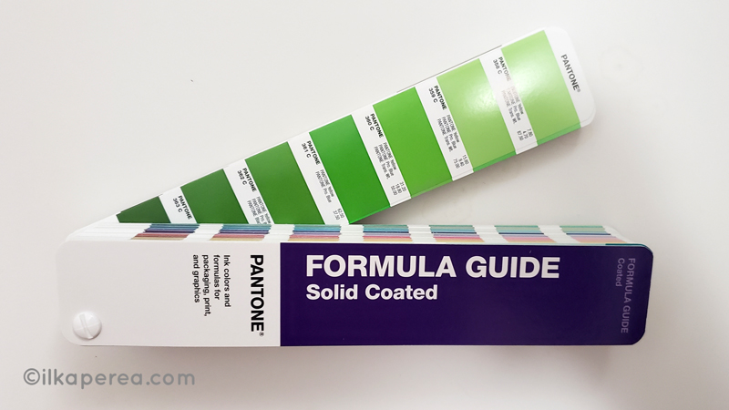
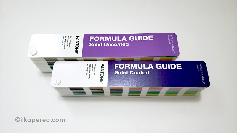
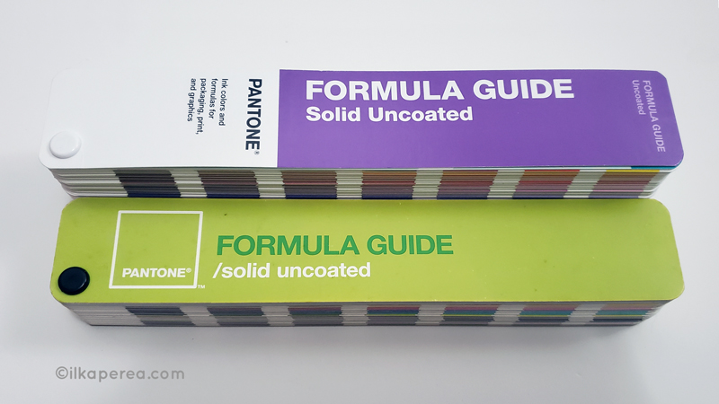
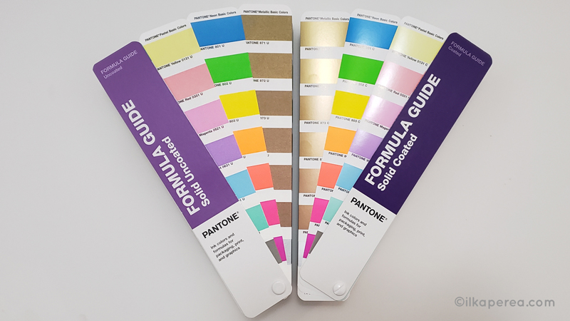
The Pantone Matching System (PMS) has color guides for graphics that are identified by the suffixes U, C, or M. These letters represent “uncoated”, “coated”, or “matte” papers, respectively. This distinction between paper types is because some colors do not differ at all when printed on different types of paper, while others make an extreme difference.
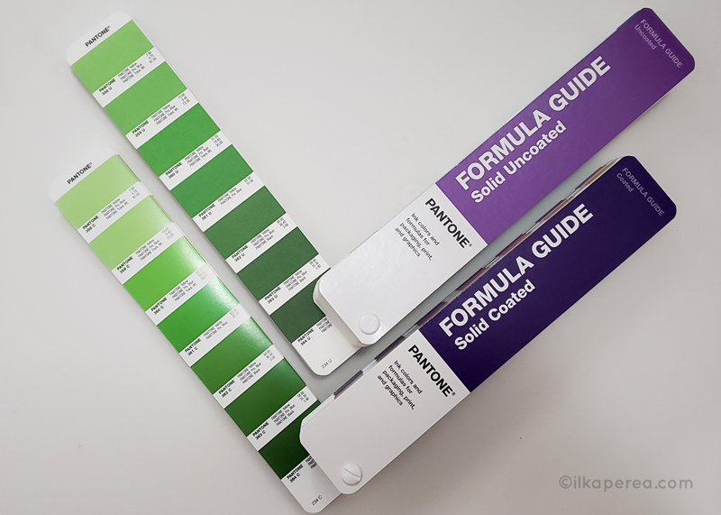
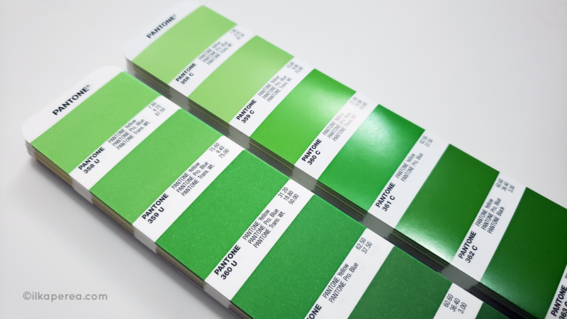
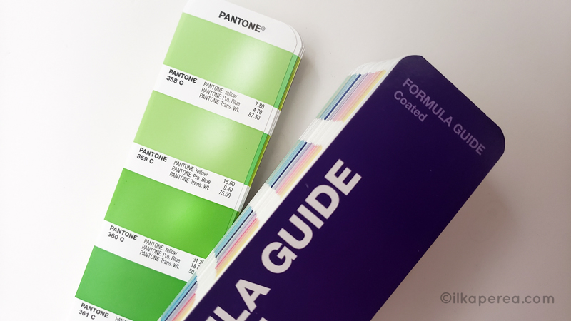
If you look closely at the image below you will notice that swatch 359 U is quite different from swatch 359 C. The ink “359” has been applied to different types of paper resulting in different shades. There is also a visible difference between swatch 360 U and swatch 360 C.
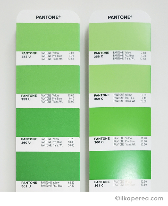
When using Pantone colors in graphic design, the project to be printed must be specified including the corresponding suffix. That is, when you send a design to the printer, for example, a logo for a business card, you must deliver the file along with the Pantone color information specifying the letter and number.
It is always best to have this information in a brand book or visual identity guide. In this way, the employees of the same company can use the same elements consistently throughout the marketing materials and keep concordance with the original designs.
Considering the costs
Printing with Pantone can be expensive, but inconsistency in product colors or marketing materials is a risk that some brands are not willing to take. Therefore, graphic designers must be prepared and know how and when to use them.
In this regard, graphic designers can rely on the color libraries on the Pantone website. It also offers some features to find and choose the color code you are looking for including conversion from Pantone to RGB, CMYK, and HEX. However, these options are not as reliable as the printed guide although it is a much more expensive resource than digital.
What is the difference between CMYK and PMS?
Among the most important color profiles for printing are CMYK and PMS. But when is the one used or why is the other one used?
Pantone printing is best for large projects with pure and consistent colors. It is a single Pantone ink that is used in the process. Therefore, it is much purer than CMYK, and the difference is visible. CMYK printing is best for a mix of different print jobs.
Printing Process
To better understand the difference, it is necessary to know the printing process of each one of them.
The ink is prepared according to the Pantone formula and carefully placed on a plate where a machine will print it on the desired object. Calibration is no longer an issue because there are no other plates to calibrate against.
In contrast, CMYK uses four plates (cyan, magenta, yellow and black) to print the desired color. This printing mode is widely known. Most people have access to a color printer in their homes or offices. They use color cartridges that when mixed produce a wide range of colors in the printout.
The CMYK printing method is more economical compared to the Pantone method. However, the desired color has the potential to come out slightly different each time it is printed, depending on the printer’s calibration.
Using Pantone colors for branding
As explained above, companies use brand books and visual identity guides to give their staff a uniform corporate identity. Staff must be able to identify with the brand and for this, color consistency is critical.
Each piece of communication must maintain the approved style established in the brand book. Using Pantone colors for the graphic design of business cards, badges, signage, advertising campaigns, brochures, and merchandising, demands to follow the parameters of the style guidelines, including colors.
Therefore, colors must be specified from the PMS codes in the corporate identity guide as well as the CMYK, RGB, and HEX color codes.
Using Pantone colors on the Web
Using Pantone colors on the Web did not make much sense since this color matching system had been intended from the beginning for printed materials. Its use in digital media created a lot of mistrust.
Pantone Color Bridge Guide came to fill this need for designers to set a color that would match both print and digital environments. This tool facilitates the transition of printed designs such as flyers or brochures to be posted on social media or landing pages while accurately preserving brand colors.
Besides, Pantone offers the Pantone Color of the Year to use in print, social media, and on the web.
Some Insights
When thinking about how you want colors to impact your brand through print, you should consider color profiles for graphic design. Pantone offers graphic designers the confidence and security of a promise: the color you choose at the beginning is the color you get at the end.
Designers not only count on color consistency in their designs but also know that it will be consistent wherever in the world it is printed or manufactured. The Pantone Matching System has become a standardized color language in the design industry. Pantone was not the first color standards language, but it is certainly the best known.
Pantone Color Guide Replacement
I recommend periodically updating Pantone color guides as swatches tend to fade over time. The company suggests replacing it every 12 to 18 months. I don’t find it necessary to change it that often, but it is important to update it at some point.
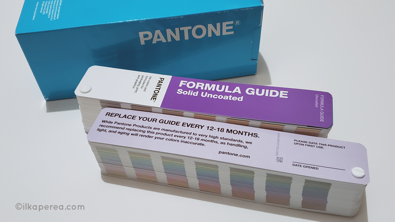
This is because Pantone changes and adds colors to their guides, so it is convenient to use the same color codes as the rest of the industry. Managing outdated information is always misleading.
Share
Spread the love… and this post!
If you liked it, share this post on your social networks such as Facebook, LinkedIn, or Twitter. Smart designers share good things with others.
Bibliography
- Dabner, D., Stewart, S., Vickress, A. (2020). Graphic Design School: The Principles and Practice of Graphic Design. (7th ed.) Wiley.
- Pantone. (n.d.). Pantone Formula Guide | Coated & Uncoated GP1601A. Retrieved May 7, 2020, from https://www.pantone.com/formula-guide-coated-uncoated
- Pantone. (n.d.). Pantone Color of The Year 2018 – Pantone 18-3838 Ultra Violet. Retrieved June 15, 2020, from https://www.pantone.com/articles/past-colors-of-the-year/color-of-the-year-2018
- Pantone. (n.d.). Past Colors Of The Year. Retrieved June 15, 2020, from https://www.pantone.com/articles/past-colors-of-the-year