Whiteness and Surface of Paper for Graphic Design
Last Updated on: 20th March 2024, 11:05 pm
Paper has different attributes and features. All of them are truly relevant for graphic designers if paper is chosen as the material and medium for a project. Paper is usually chosen for its size and grammage. However, some designers overlook the whiteness and surface of the paper for graphic design when choosing a type of paper among the many types offered on the market.
Designers must be familiar with the properties and types of paper to find and choose the most suitable paper for each need. Although whiteness seems to be an obvious property of paper, a very observant designer will notice that not all white papers are “white”. In this sense, most known papers are smooth, but some are smoother than others.
This post explains in depth these two characteristics of paper: whiteness and surface.
Paper Whiteness

Not All that Glitters is “White”
Anyone can easily compare paper sizes. But how “white” a sheet of paper is perceived depends on how strongly the light is reflected by the paper. The range goes from white to black. In between there are shades and other light and dark tones.
Depending on the manufacturer, a bleach is added to the pulp which, depending on the dosage, results in a certain reflective strength. The more light the paper reflects, the whiter it appears.
As with paper size and grammage, there is a difference in standards that regulate the whiteness of the paper. The most commonly used unit of measurement is international whiteness, as defined by the CIE. The abbreviation CIE stands for Commission Internationale de l’Éclairage, which means “International Commission on Illumination”. However, in the U.S., the whiteness and brightness of paper are defined by TAPPI (Technical Association of the Pulp and Paper Industry). Hue is universal and represents the color of the paper as measured by the CIE LAB model (more formally known as CIE L *, a *, b *).
Paper Brightness
TAPPI defines brightness as the measure of the reflectance of blue light (wavelength 457 nanometers, 44 nm wide). There is also an ISO standard for measuring brightness (ISO 2469:2014 – Paper, paperboard, and pulp – Measurement of diffuse radiance), but it is rarely used. The most common measure is the CIE whiteness scale. The maximum value on the CIE scale is 171.
As with whiteness, values greater than 100 can be found in brightness measurements, meaning that more light is reflected than was originally directed to the paper. This is due to optical brightening by the reflection of part of the ultraviolet spectrum into the visible spectrum. The TAPPI brightness measurement is usually between 110 and 120, below the usual CIE whiteness levels. This is because OBAs have only a small spectrum to reflect.
OBA (Optical Brighteners Agent) is the English term for optical brighteners. Optical brighteners are chemical agents that are very often used in photographic papers. They are incorporated into the coating and sometimes into the paper base itself. The function of optical brighteners is to artificially whiten a paper.
Paper Color
Paper usually comes in bluish or light creamy colors. This is because it is very difficult to produce a “true white”. A true white paper would reflect all colors of the spectrum equally, while a bluish-white shade would absorb some of it and reflect more of the shorter wavelength of blue light. In turn, a light creamy white shade absorbs more blue light.
The color tone of paper is always measured with the CIE LAB model (CIE L *, a *, b *). This model covers the entire color spectrum, while other models such as RGB or CMYK only cover a subset of the LAB gamut.
However, the bluish-white shade and the cream-white work for specific design projects. For example, a bluish-white shade is best for short documents such as brochures and catalogs, as it provides the best contrast for the black ink and therefore optimum legibility.
On the other hand, a more neutral shade or cream white is often used for books, as it provides less glare and less eye fatigue when reading for prolonged periods of time.
True whites are most often used for printing at the office or for school homework.
Paper Surface

Roughness is not Always Bad
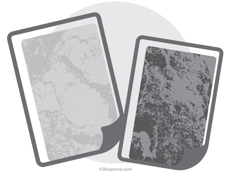
Regarding the paper surface, it ranges from smooth to very rough. There are two main categories of surface grades:
- Hot-pressed paper: is pressed with high-pressure hot cylinders, so it is smoother and has less texture.
- Cold-pressed paper: is manufactured at lower pressure and without heat, so its surface is rougher and more textured.
Smooth surface papers
Many drawing papers have a relatively smooth surface. But there are also differences between smooth papers. Normal printer paper is also smooth, but not as smooth as Bristol paper, to give an example. A smooth surface has the advantage that the colored pencils cover better, fewer layers are needed to completely cover the paper. Shortly, Smooth surface papers are:
- very suitable for graphite pencils and colored pencils.
- unsuitable for charcoal, as it has very little adhesion.
- fine, smooth transitions, and fast coverage of the paper surface texture.
- good blurring properties.
- very suitable for portraits, fine animal drawings, still lifes.
Bristol paper is probably the smoothest paper a designer can get. Indeed, it is extremely smooth, has hardly any texture, and is especially suitable for pencil portraits, as very smooth transitions and even surfaces are achieved. Other writing papers with little grain and a smooth surface also perform similarly well.
Printer paper or drawing paper offer a clear advantage: they are comparatively cheap and available almost everywhere. But, unfortunately, it is not very durable due to the light weight of the paper, i.e. its thickness. It wrinkles easily and does not tolerate much erasing.
Rough and/or textured surface papers
Ordinary sketch pads usually have a very light texture and a very fine roughness. They are not as smooth as Bristol paper, but they are not too grainy either, so a good middle ground is achieved with them. In conclusion, rough/ textured surface papers are:
- very suitable for pencils and colored pencils.
- more layers can be applied.
- good smudging properties, but the paper texture remains slightly visible.
- conditionally suitable for charcoal.
- suitable for portraits, animal drawings, still life, and landscapes.
The pencils adhere well to the paper and can be smudged and erased well. However, there is always the risk of showing through the texture of the paper. Nevertheless, you can draw well and with a lot of details.
Paper with a very grainy or very rough surface
These papers can be used especially well for charcoal. Although, it can be used for graphite pencils or colored pencils. Charcoal adheres well and does not smudge easily. It is recommended to use paper formats larger than DIN A4 or US Letter because it is difficult to draw in detail on very small papers. In a few words, very grainy/rough surface papers are:
- very suitable for expressive charcoal drawings and landscapes.
- very suitable for rough drawings of animals and portraits (subtleties and small details are less possible).
- If you want a textured drawing, you can also draw with a colored pencil and pen.
The two sides of the paper
During the manufacturing process, the paper is wound on reels. Due to this process, the top and bottom sides of the paper have different properties. The top side is the side that faces up on the conveyor belt during production. The grain of the paper is less perceptible on the top side, so it is smoother.
The bottom side of the paper is placed face down on a wire mesh.
Both sides can be used but it is important to consider this difference to achieve the desired result.
Some Insights
There is still a lot of work to be done on this subject. The surface of the paper is of great importance. Many performance criteria determine the quality and possible uses of each type of paper specified with great precision: top surface (felt side, weft side, biface, purity), coloration (whiteness, color variations), smoothness (machine smooth, satin on one or both sides), coating (matte, semi-matte, glossy), and so on.
Regarding paper whiteness, there are environmental considerations that designers should be aware of. Recycled paper is made from 60% to 100% waste paper. White recycled paper must either be bleached without environmentally harmful chemicals or be made from pure cellulose fibers from FSC (Forest Stewardship Council) certified forests.
Any Thoughts?
In the comments section, tell me if you already knew these paper features. As a designer, what paper surface and whiteness do you use most often?

Share
Spread the love… and this post!
If you liked it, share this post on your social networks. Smart designers share good things with others.

Bibliography
- Asuncion, J., Vidal, A. (2003). The Complete Book of Papermaking. Lark Books.
- Dabner, D., Stewart, S., Vickress, A. (2020). Graphic Design School: The Principles and Practice of Graphic Design (7th ed.). Wiley.
- Hunter, D. (2011). Papermaking: The History and Technique of an Ancient Craft. Dover Publications.
- Kurlansky, M. (2017). Paper: Paging Through History. W. W. Norton & Company.
- Meggs, P. B.; Purvis, A. W. (2016). Meggs’ History of Graphic Design (6th ed.). Wiley.


